
When you write a letter, an email, an opinion piece, a blog post, etc. what you write is not as important as what the recipient reads. A recent opinion piece in the local paper was an attack on the school administration yet was mostly read as an ableist piece against students. I tell people all the time, proofread things through the reader’s eyes. (There’s that empathy thing again.)
This goes for websites as well. Especially patient sites. I am using my hospital’s (“my” as in the one I go to, not the other one that I own) (ok, I don’t own a hospital) patient portal and, well, it actually makes my life more difficult than if I did not use it. I know I can be a curmudgeon but hey, I have cancer, be nice to me.
I want to show you what I am dealing with. Keep in mind that I do a good amount of web design but this is not about my thinking I can do it better (and hell yes, I can) but it is about showing issues and maybe this will work its way back to the designers. This blog is anonymous, I do not want to call out the hospital or its IT department in any way. The ONLY changes to these screen shots are proper nouns and phone numbers. Really. And I will do my best to not offer opinions, only facts. Let’s see how that part goes.
Note that I get emails saying …
You have an upcoming appointment with one of your health care providers. Please sign in to the Patient Portal to check your appointment schedule on your Home page.
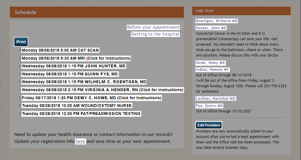
Here is the important part of the home page. I sign in and see this along with a main menu, etc. but this is the prominent center of the screen:
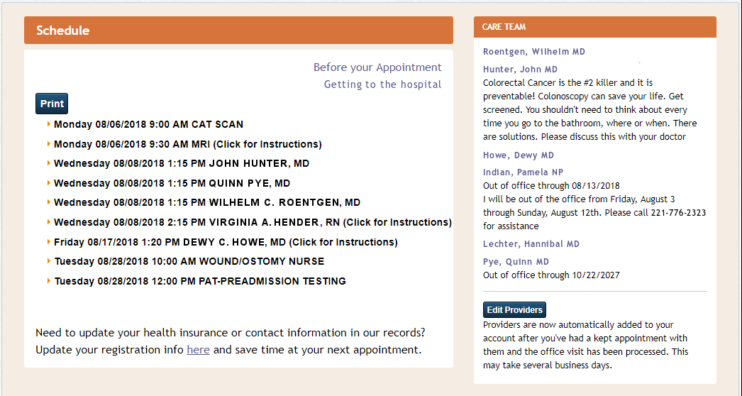
We (me and you, aren’t you lucky?) are going to look at various parts of this from many points of view. The information it conveys (or does not), ease of use, accessibility, validity, etc. Clicking on the images will enlarge them if you so desire.
Demoralization and crushing of hope
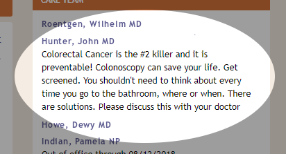 Note that the “Care Team” on the right side of the screen is made up of doctors and providers who I have seen and am working with. It is vital to note, they are not doctors I have not seen, it only shows those providers for whom I am already a patient.
Every time I sign into this site I see my surgeon (extremely highly regarded) telling me that
Colorectal Cancer is the #2 killer …
Number 2 after what? Natural causes? Am I going to die? This is not an advertisement telling others they need to check for colorectal cancer because if you see these words you are already being treated by a colorectal surgeon! WTF. I have colorectal cancer. Pretty much everyone reading those words has been diagnosed with colorectal cancer. Let’s remind me I am dying. And yes, I have read the rest of the paragraph.
Hey, pal, do you know the time?
(Ignore the 9:00 AM CAT scan for this discussion.) I have been told that I have an MRI at 9:30 in the morning. The written notice I received clearly says (bold is in the original) …
… arrive in the MRI department 45 minutes before your scheduled exam start time.
And during the reminder phone call the gentleman stressed that I …
… must arrive an hour before, at 8:30.
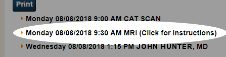 So what is the essential time in this case? The patient portal is there for me to see my appointments as the referenced email states. It appears that in this case, the 9:30 AM time is completely moot. That is not when I need to arrive, and if in fact I arrive at that time, they will have to reschedule me (according to the gentleman on the phone).
This item on the schedule for 9:30 is problematic unless I remember to get there 45 60 ? minutes early. How to remember? I cannot write it on the home page to which I am supposed to refer.
I know what you are saying … “Just click for instructions as it says!” Ok, I will, and this opens up:
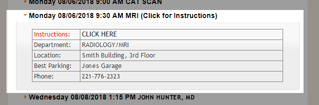
Well that is not terribly helpful.
But wait, there’s more! What is that in red? Why is there any text in red and what does it signify? And a “CLICK HERE” … seeing that I always do as I am told, I will click yet again for some instructions (but not on the red, that does nothing) and this comes up …
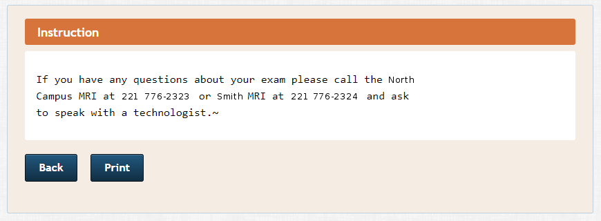
Good. I feel so much better instructed now. I don’t have questions, I don’t know that the time on the home page is wrong-ish.
So what time do I show up?
Who? Huh?
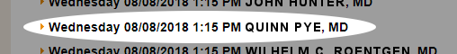
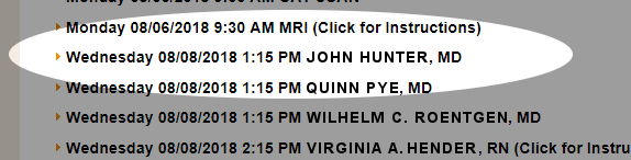
I have the cerberus appointment on Wednesday. Who will be there? Well, it appears the wonderful Dr. Pye will be …
But whatever you do, DO NOT LOOK ON THE RIGHT SIDE OF THE SCREEN SHOT … DO NOT LOOK AT THE “CARE TEAM” LISTING …
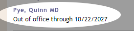
Damn, you looked.
Dr. Pye appears to be out of the office for the next nine years, which is actually a good thing since I hope to be alive in nine years and that date, B”H, will be my 70th birthday. She will be my present! But will she be at the meeting on Wednesday? If not, who will be taking her place?
Excuse me, huh?
I know you are looking at the CARE TEAM list and wondering, is there any way to edit the list? Can I add or remove doctors? Of course there is, just look at the bottom of the CARE TEAM column.
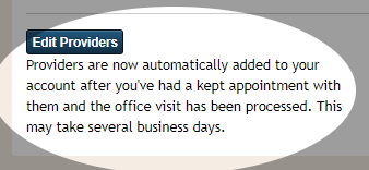
Here is it clearly noted that your providers are automatically added to this list “after you’ve had a kept appointment …” I know what a kept woman is (not that I have any experience in such things) and I know all too well what it is to be verklempt, but a kept appointment? Heck of a place for a past participle … And if you click on Edit Providers, you can remove someone from the list but neither add nor change anyone. Is that editing or removing? Definitely not kepting.
Flexible? I can bend in all sorts of ways.
Let’s not forget about my flexible sigmoidoscopy on Wednesday. I need to be there at 12:30 PM for it to happen at 1:15 PM for my 1:30 PM cerberus appointment. You can see that clearly in this part of the schedule …
“All the truths of mathematics are linked to each other, and all means of discovering them are equally admissible.” ~Adrien-Marie Legendre
Most, if not all, web design “best practice” lists specify that links should be highlighted in some way and all formatted alike. The classic is underlined blue text, but that is becoming a relic for many reasons. For accessibility, readability, understand-ability, etc., links should look and work the same within a site. It is simply best practice.
Here is my home page on the Patient Portal with all links (that I can find so far) highlighted.
Let’s see how links are identified:
- Blue virtual-buttons with white text
- Bold black text with “(Click for instructions)”
- Bold black text without “(Click for instructions)”
- Blue-ish text with no decoration
- Blue-ish text, underlined
A designer could argue that the schedule listing items are not true links (<a> tags) but are list items (<li> tags) but this is only a partial and weak argument, especially with some having the additional, although somewhat fallacious “Click for instructions” instruction. Five different link-identifying styles? None explained. Simply stating “Click on a scheduled item for further information” would work since all minimally open up to show the location of the scheduled event.
(Here is a fun thing to try … see the handicap logo at the top right of the browser window? It has always been there. Click on it and click on “UNDERLINE LINKS.” Then CLOSE. You will now see four links in my previous paragraph. Didn’t know they were there? Pretty useless having links you don’t know exist, huh? Now undo what you just did or it will drive you crazy.)
Speaking of accessibility
There are Web Content Accessibility Guidelines (WCAG) put out by the W3C Web Accessibility Initiative (W3C WAI) under their tag line “Strategies, standards, and supporting resources to make the Web accessible to people with disabilities.”
Web Content Accessibility Guidelines (WCAG) is developed through the W3C process in cooperation with individuals and organizations around the world, with a goal of providing a single shared standard for web content accessibility that meets the needs of individuals, organizations, and governments internationally.
The WCAG documents explain how to make web content more accessible to people with disabilities. Web “content” generally refers to the information in a web page or web application, including:
- natural information such as text, images, and sounds
- code or markup that defines structure, presentation, etc.
The U.S. Department of Education mandates that school district websites be accessible and has several initiatives in this matter. It falls on the Office of Civil Rights to enforce this, and they do.
Section 508 of The Rehabilitation Act compels federal government agencies to make all of its electronic information and technology fully usable by people with various disabilities. This means that websites, software, webinars and PDF user guides, to name a few examples, have to meet specific accessibility requirements to comply with the law. The revised Section 508 refers to the Web Content Accessibility Guidelines (WCAG) 2.0, Level AA.
Although Section 508 as it’s written does not apply to the private sector, nor does it apply to recipients of federal funds, some funding agreements have nevertheless incorporated the requirements of Section 508 as a condition of receiving funds. For example, Medicare and Medicaid rules state that healthcare institutions receiving reimbursements through these programs must make program information “readily accessible” to the public. In the most recent update, readily accessible information is defined as “electronic information and services which comply with modern accessibility standards such as section 508 guidelines, section 504 of the Rehabilitation Act, and W3C’s Web Content Accessibility Guidelines (WCAG) 2.0 AA and successor versions.”
When I run my home page in the Patient Portal through a standard Accessibility Checker against WCAG 2.0 AA I get 15 errors and 3 warnings. Those numbers are a tad misleading because, for instance, there are 92 instances of “Info and Relationships 1.3.1” flagged as errors and 17 warnings. There are 8 warnings of insufficient color contrast.
Ugh.
Let’s do a quick review
- Depressing information: I have the #2 killer of bloggers and other mere mortals
- Bad information: Dr. Pye will be at my appointment
- Misinformation: Dr. Pye is out for 9 years
- Missing information: Flex sig anyone?
- Lack of information: When appointments really start
- Confusing information: Where links are; what is clickable
- Accessibility: If the hospital has patients with disabilities, this may be an issue
And this is only two information boxes out of many just on the home page.
No, I don’t have way too much time on my hands. I have cancer, you know. The number 2 killer of crotchety bloggers.

I’m not sure whether to laugh or cry about the information in this post. I hope your appointments go well, especially the one in 2027.
Hold on! On the right side if the page there is a doctor named Hannibal Lechter!!! You just ignore that?? WTF! ?
As I had mentioned, real names were changed. Most of the new names were for a good reason. My radiologist became Wilhelm Roentgen for good reason just as there was a good reason for my surgeon to be John Hunter. When I got to one of the doctors who I was not going to talk about, and don’t know if I will be seeing him again, I started to draw a blank … and then I rhymed with his last name. I did not think anyone would notice!